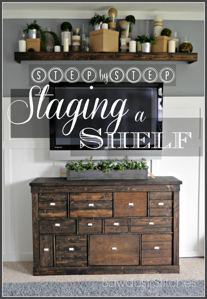
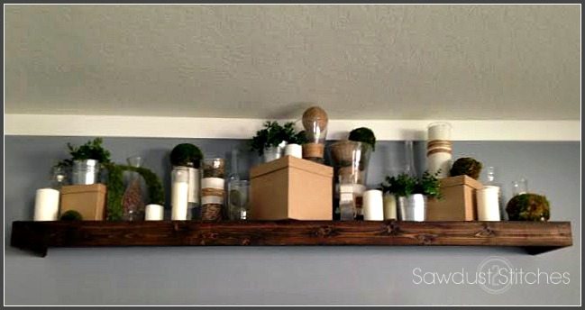
I don’t know about everyone else, but I use to really struggle decorating shelves, above kitchen cabinets and shelves. Then I realized what was wrong. I HATE clutter. I really struggled with the idea off putting up a bunch of knickknacks trying to fill a space. But on the flip side, not putting anything up defeated the point of the shelf.
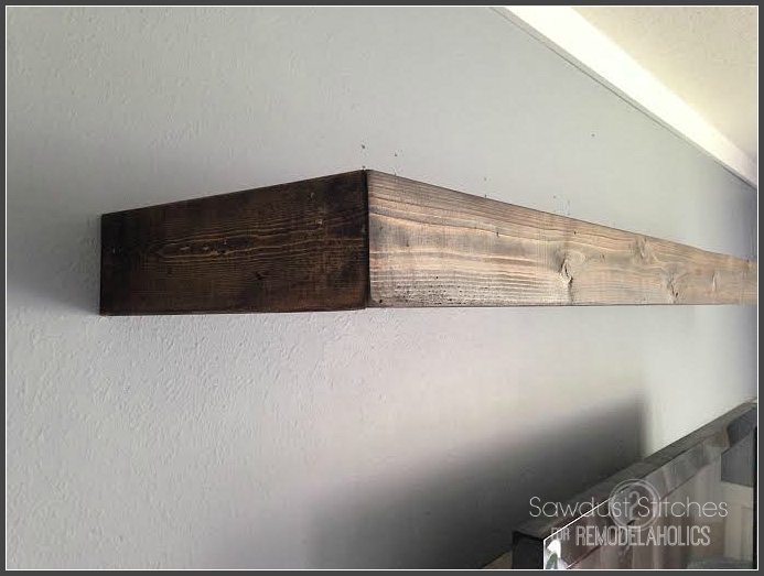
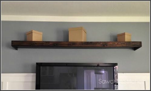
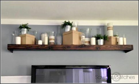
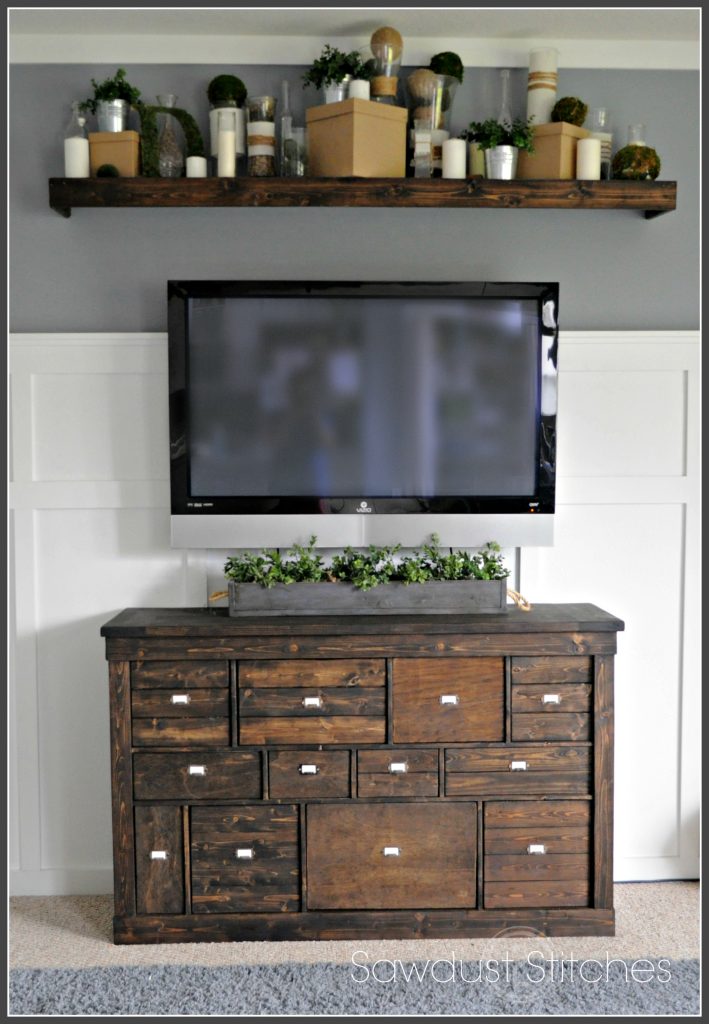
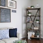
So, I am going to show you how I found my happy medium. Let’s get started. Here is my beautiful blank canvas/shelf. It’s beautiful, but boring.
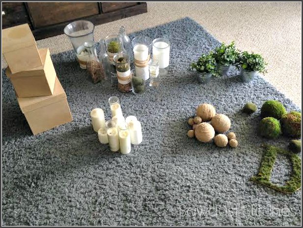
When staging I usually find 3 or 5 different types of items. As a general rule in art, I typically try to work in odd numbers. The theory behind it is, in nature most everything is done in odd numbers.
In this case I chose:
- Vases
- Candles
- Potted Greens
- Paper Mache’ Boxes
- Decorative Balls
( The items are normally dictated by what I have lying around, and whatever items I can find that is cheap.)
Paper Mache Boxes: Cheap and available at most craft stores.
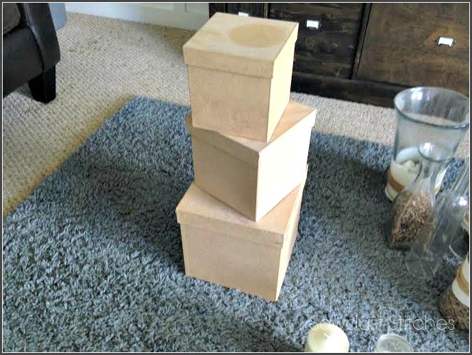
I tend to start by staging my largest items first, this way I can easily distribute the visual weight. For my largest item I used paper mache boxes. I just liked them, they were cheap.
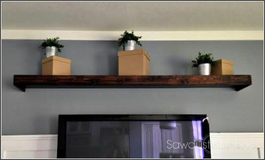
Potted Greens: I got the tins from Ikea for less than a buck a piece, and the greens you can usually get wherever floral stems are sold.

I used these as my largest “color”. Again, I had three, and wanted the color to be distributed evenly.
I knew I wanted the color to be visible and not hiding behind other items. I made sure they were on top of, or in front of the larger pieces.
Glass Vases: I picked up most of these at thrift stores. You can get them super cheap and in a variety of shapes and sizes. Some of them I dressed up a bit with jute/twine and muslin.
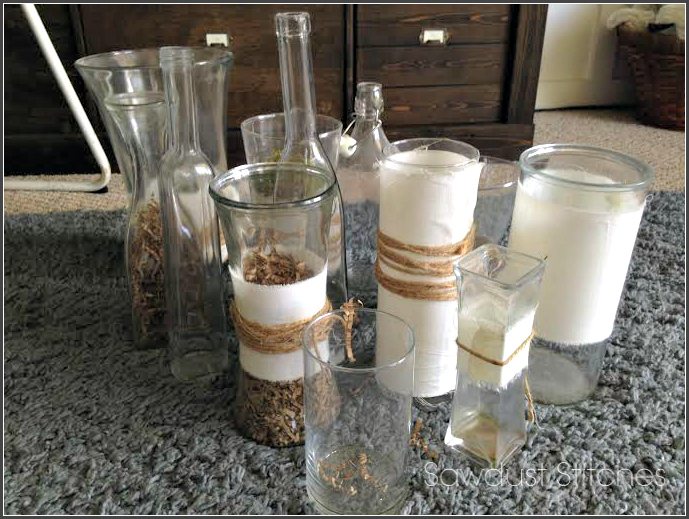
Once my large items, and pop colors were in place, I brought in a neutral. I had quite a few glass vases , so I used them as “filler” . They weren’t my focal point, so they are a good neutral to fill in the gaps.
(At this point you will want to step back and make sure that it doesn’t look heavy in any one area.)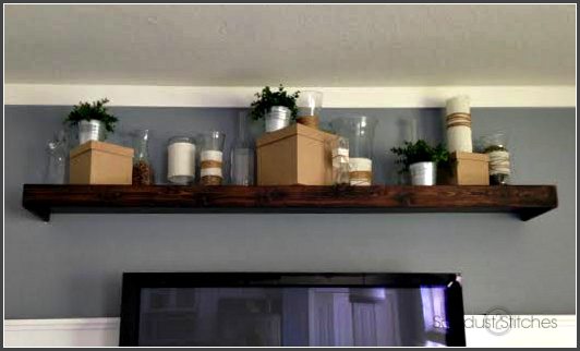
Candles: I picked up most of these candles at the Dollar Store!
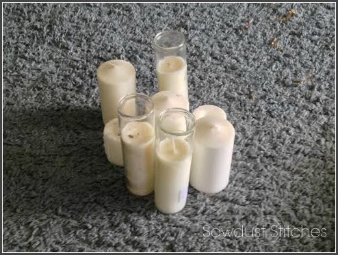
Although the candles are white, they will still be a contrast to the other items. Whenever you bring in a contrasting color, make sure to space them out. To test this, I just stand back and make my eyes go blurry and see if anything sticks out like a sore thumb.
Can you see that the white is evenly distributed ?
Twine Balls: Styrofoam ball + twine+ hot glue gun= Cheap , beautiful visual texture. 
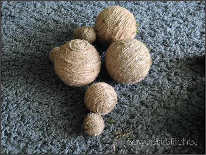
They are essentially just fillers. I ended up putting most of them in the vases.
Moss Balls: Moss sheets+ Styrofoam ball+Hot glue gun= Perfect finishing touch.
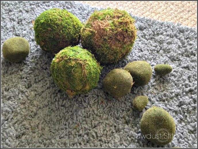 Again, with the moss, I made sure that they were spread out. Even though they are small, they are my pop color. I also had to consider where my other “colors” are, and place them accordingly.
In summary When staging I rely on repetitiveness in order to create a cohesive look. I work with one type of item at a time. Lastly, don’t over do it. Find one or two colors and then use a lot of neutrals. It is surprising how far a little color can go.
So that is it. Go and do my friends!
Take Luck,
Corey

I’ve tried doing something similar above my office desk and it doesn’t look half as good as this. I’m going to take it all down and follow your steps: biggest to smallest. Great tips!
It really is a simple process once you learn a few tricks! Good luck, and thanks for your comment and reading!