Alright folks, you might have noticed that I have been MIA recently… I have an excellent excuse, I promise! Over the past two months my husband and I have helped some friends of ours take on a very large project, and when I say “very large” I really mean HUGE! I have completed my fair share of room/home makeovers that include a handful of renovations. But this, THIS was the first whole house gut that I have ever been apart of. When I say “gut” I mean we had full out Chip style “demo day”. (Which in actuality was more like a week and a half)
So today, I am giving you a makeshift tour of the 1970’s ranch before we gutted it, along with some of the process of tearing it apart! Lots of walls came out, and man alive there was enough paneling to build a small city! Enjoy!
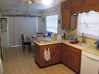
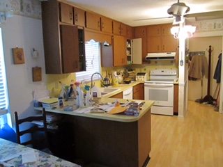
Kitchen
Kitchen Before
Check out this kitchen! Every single part of this kitchen is straight up 70’s composite materials. It was horrifically awesome! Originally we were trying to think of way that we could work with what we had. Ultimately, it was decided that it wasn’t worth saving the hideous cabinets to save money. The kitchen is where they spent almost all of their budget. It was a hard idea to swallow, but honestly if you are remodeling put your money into the kitchen! It is definitely an investment, but for resale value it is a HUGE asset.
Kitchen Demo-
The kitchen was very narrow galley style kitchen. Pictured below is Andy (my guy) and Garrett (her guy) doing some serious demo. (Don’t ever remove walls unless you verify that they aren’t structurally necessary!) They are in the process of tearing out a divider wall/pantry that separated the whole kitchen from the rest of the house! It was weird just straight up weird. It was the first wall to come down, and it made a huge difference!
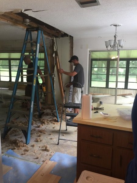
When all was said and done, we removed the wall/pantry, moved a doorway, removed cabinets, a back splash, wallpaper, and two layers of flooring. We took this thing down to it’s bones, and it already looked so much better!

Kitchen Vision-
Now for the fun part…designing. We had lost a lot of storage space when we took out the pantry, so we brainstormed some practical storage ideas for the kitchen. I personally have always been a huge fan of large islands, and Jena, had a great idea of creating storage on both sides. So we planned the entire kitchen around an island… After walking around countless stores and browsing tons of magazines, I THINK we narrowed down her(Jena’s) style. She loves all styles… hahah except eclectic. (weird, huh?) Anyways, she loved ALL THE styles, but after weeks of observing her picking out styles she liked I started shaping the concept I thought she might prefer. We ultimately came up with a very modern farmhouse with a bit of boho, and mid century flair. We wanted a pop color . But a pop color doesn’t always need to be an actual vibrant color! We are using black, and brass as our pops with natural greens! It’s going to be gorgeous! Here is the general idea for the kitchen.
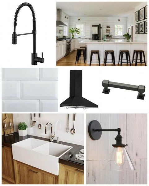
4X8 Soft White Wide Beveled Subway Tile ![]()
Glass Shade Wall Sconce Wall Lamp (Black)![]()
Dining Room
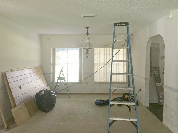
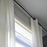
Dining Room Before-
Check out that light fixture! I think it pretty much sums up the style of this entire house. There was no paneling in this room, but it did have some awesome curtain toppers (You know the balloon kind they sure to stuff with plastic bags? They slightly resemble the puffy sleeve dresses from the early 80′? Oh yeah, it was great! With the added bonus of WALLPAPER!!
Dining Room Demo-
The biggest part of the dining room demo was changing the location of the door (see the new construction on the left?). We thought a barn door would look amazing on the left wall so we rearranged some doors. (It was also very practical decision when considering the house layout.) The small archway on the right was just weird and awkward and it needed to come down. So after making sure it wasn’t necessary we took it out!

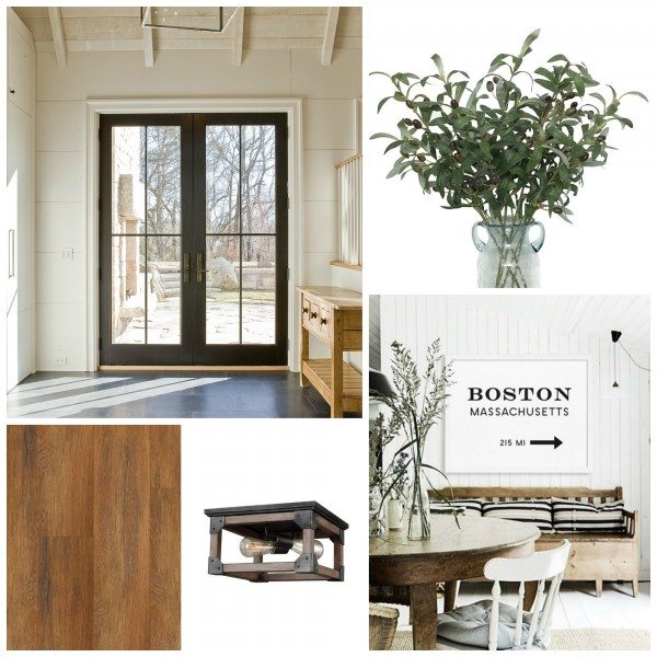
Dining Room Inspiration-
I am not going to lie, the dining room is the room I am most excited about! Once we had a general idea on the style we were going for, this space just mentally fell into place. I could just “see it!”. While it was a “formal” dining room, we wanted it do have comfortable vibe. This dining room will be apart of a very open concept living area, so it needed to flow seamlessly with the rest of the house. This is what we came up with. 
Hand Woven Natural Jute Area Rug ![]()
Heavy Faux Linen Curtain White ![]()
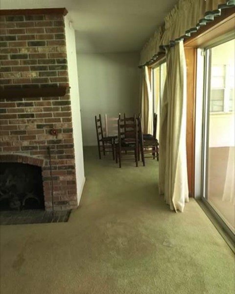
Entry
Entry Before

Entry Demo
As you can see in previous pictures, the entry is almost apart of the dining room. They had a weird little archway that I am assuming was suppose to separate the two areas. Which it did… kind of. In all honesty, it just made the area look smaller. The great thing about an open floor plan concept, is that is can make even the smallest areas look large and grand. So down came the wall!

Entry Inspiration-
The style of the whole house is fairly minimalist. So we are trying to create a big impact with out a lot of “stuff”. A black door seemed like an obvious “must-have” along with some simple art, greenery, and a low profile light fixture with character.
Artificial Green Olive Branches ![]()
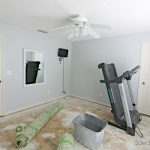
Family Room
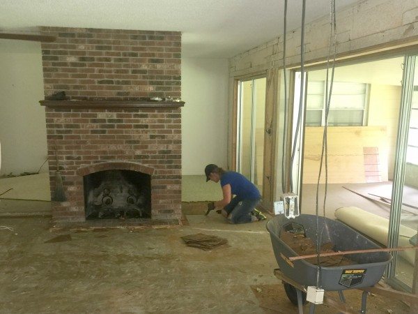
Family Room Before
There is that paneling I was talking about! So much paneling, everywhere! This space was weird to all of us. This is the “family room”, but behind the fireplace is also part of the “family room” … It’s as if the owner decided they just wanted two rooms so they added a wall there. It left us all scratching our heads. Why? It wasn’t a load bearing wall… Why??!! …

Family Room Demo:
So what did we do ? Well we tore it down, naturally. Instead of having two cave like family room(s) we create a large open space with a freestanding fireplace. Plus, look at all those doors across the back ? Aren’t they great!? This room was instantly brighter! Last thing to do was to remove the two layers of floors and we were all set.

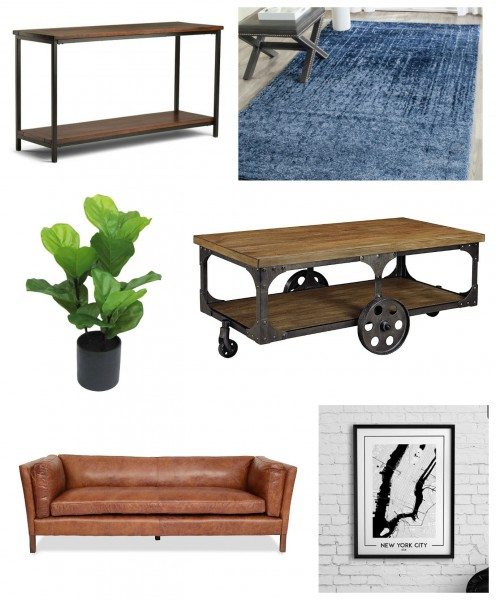
Family Room Vision:
Now, for the family room design style. We needed to keep in the same style, but wanted to set the space apart from the rest of the home. Rugs are the best way to create visual boundaries without having walls! Even if they aren’t a statement rug, a rug is a great way to define a space. In their family room we decided the best thing to do was to create a “living space” and have a secondary sitting area on the far side of the fireplace. We are loving the idea of bringing some nice rich cognac color in the couch, but that might change. We will see!
Sources:
That’s all there is to it.. now the fun part begins! Make sure you follow along as we share updates on the complete 70’s ranch makeover, over the next few weeks!
Take luck,
Corey
 Copyright secured by Digiprove © 2017

Projects are always more fun with friends.
Love the walls you took down! I love a more open space. I can’t wait to see the “after”!!!
holy moly what a project! Can’t believe how much better it looks already but I definitely can’t wait for the reveal! amazing!
Love the light fixtures – would gladly take them off her hands!!! Great demo job-rooms look awesome!